

Requiem in D minor, K. 626 (Click to see the HD version)
Typographic design poster for Mozart’s Requiem, K. 626: I. Requiem.
︎Production Book
I. Concept
My concept is to depict the spirit of “being towards death” that Mozart conveys by his last composition. There’s always an image occurring in my head while listening to Requiem, I can see a figure walking alone, wading through mountains and rivers, walking towards the stars in his heart. The river which is consuming him is the water of death and he knows his time is up, but he wouldn’t give up the reach of his stars until the last moment coming. And I know the stars as for Mozart, are the meaning of life, everything marvelous: music, beauty, romance, love. So I want to visualize the image in my head by this music poster.
I used the Gestalt theory on all the elements of my work. The combination of numerous “MOZART”s shape Mozart’s figure: because of the principles of similarity, proximity, and closure, which means different sizes of “MOZART” are the same letters and they are close, so the audience would recognize them as a group, then understand the rough figure as a completed visual element – Mozart’s figure. The starlight, the water of death, and the crosses also reflect on the principles of similarity and proximity. For the figure/background relationship, my poster uses the large space of black as the background, so the starlight can be emphasized and construct a sense of Mozart is fading into the darkness.
II. Design
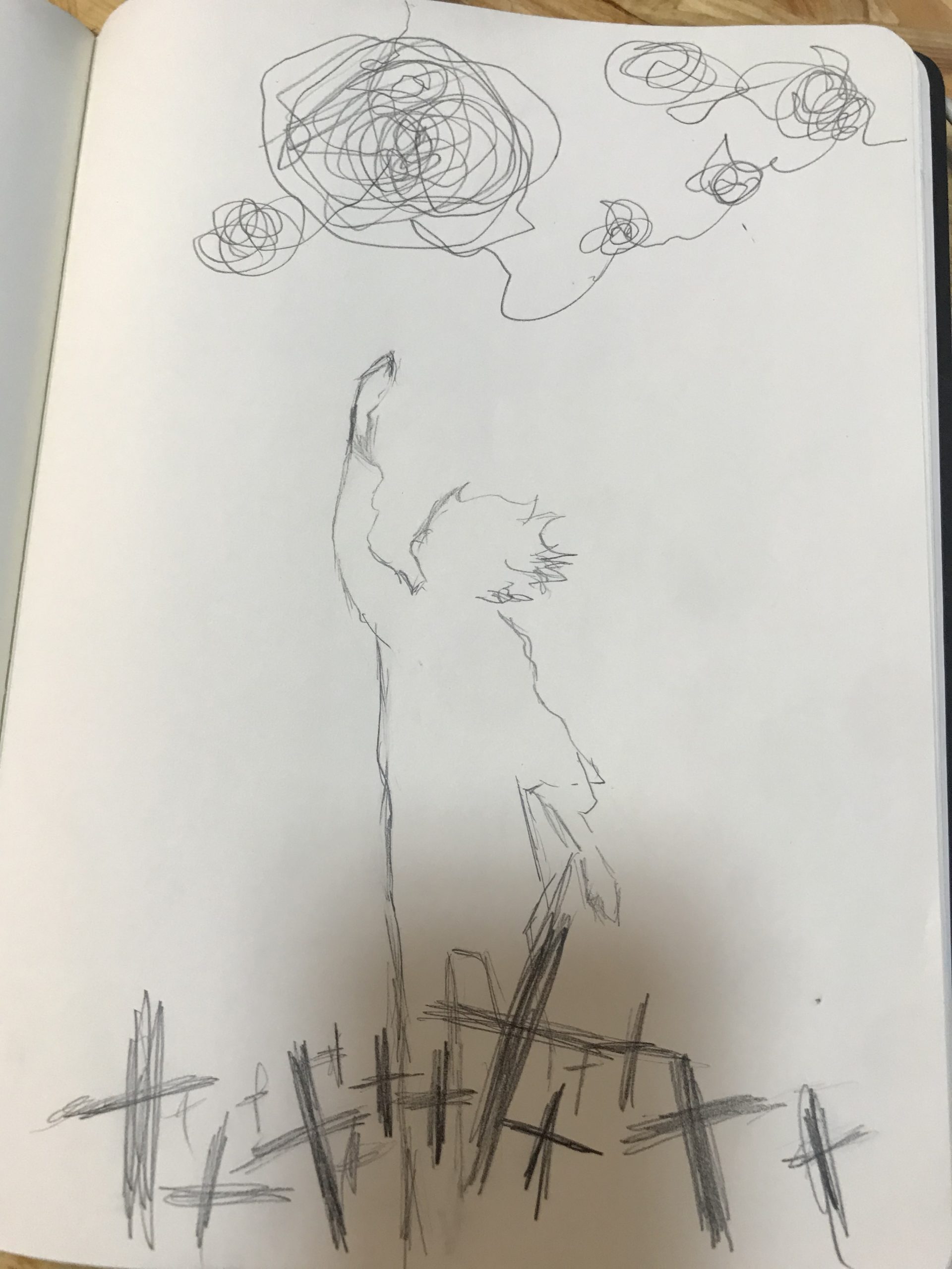
Sketch Draft:
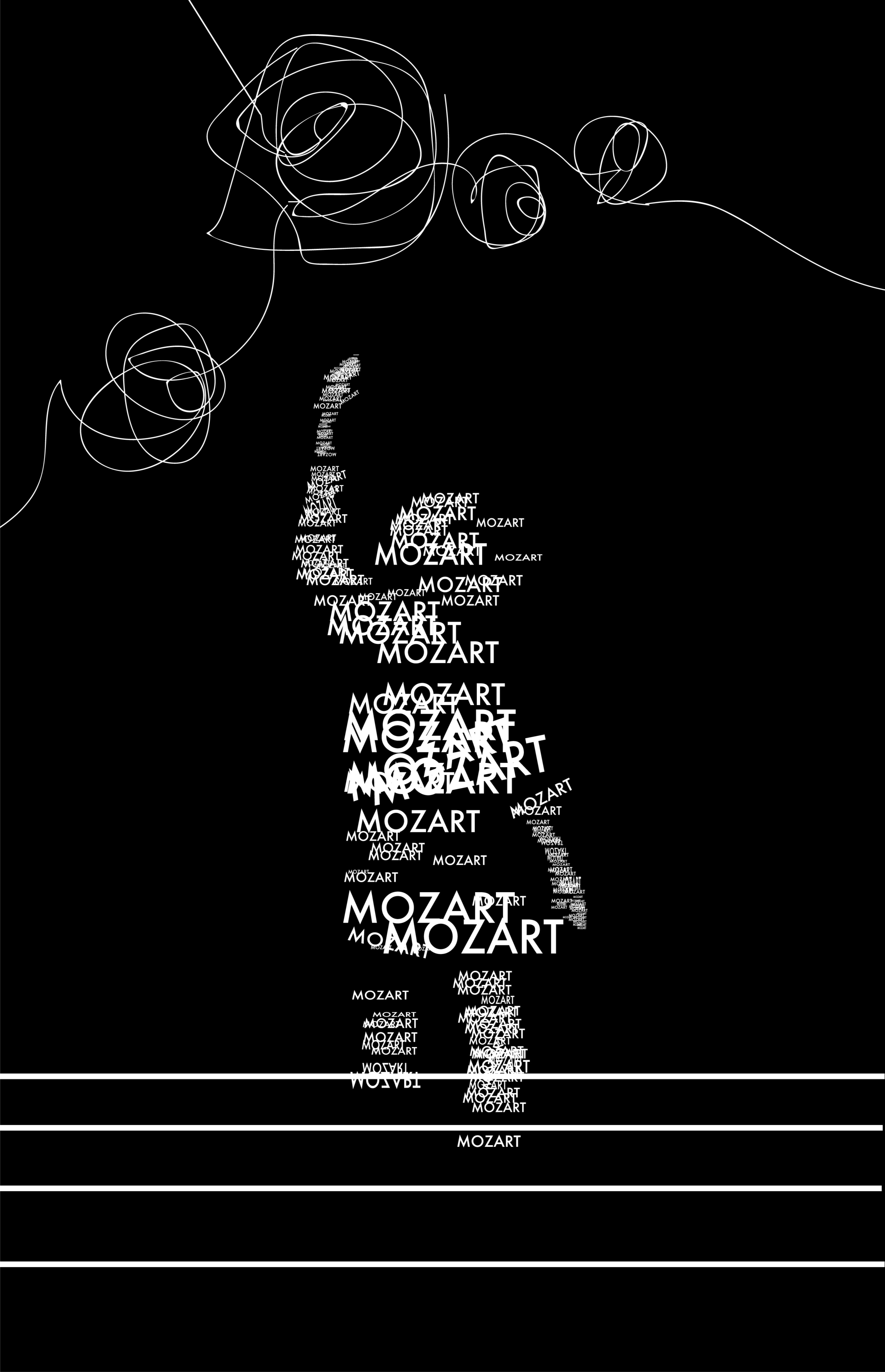
First Version:
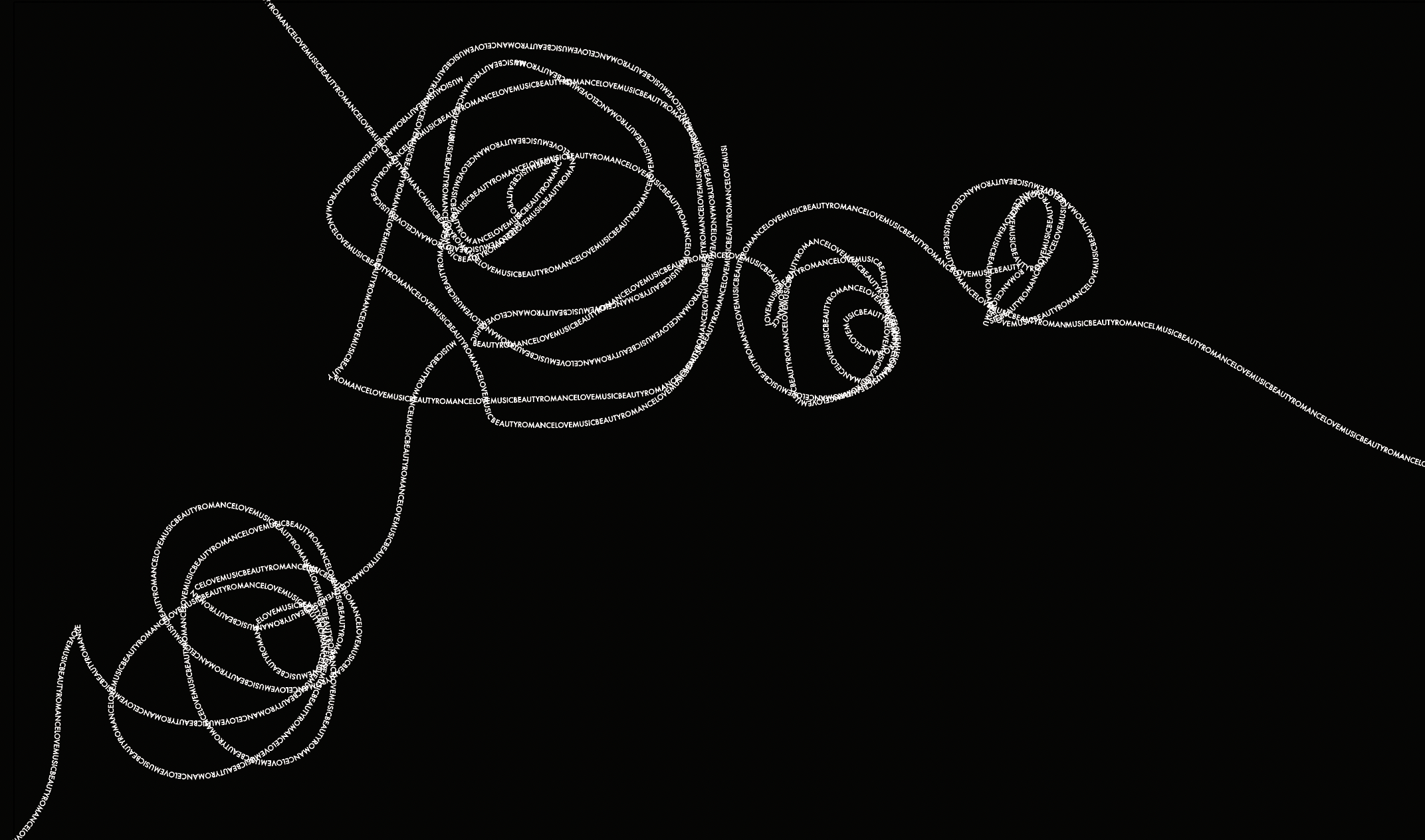
When I tried to replace all the lines of starlight with letters, I found that many lines that I just took plenty of time to draw couldn’t be recognized by the path tool or could only be recognized partly. I could only redraw the lines again and again because I was not sure the rule of the path tool to recognize the line or not, I could only try by drawing each line to see if it works. And sometimes, because there are lines that could only be recognized partly, I had to try to trace the original lines’ rest part, but it was really hard to use the mouse completing such a delicate work and I had countless failures. Luckily I made it in the end. I also added some crosses beneath the dead water to make the poster have better composition and emphasize the meaning of it.
Details of the starlight in the final version:
It consists of the letter of “music”, “beauty”, “romance”, “love”.
III. Tools
Adobe Illustrator. Original font is Futura. Always remember to use layers during designing!
